Run charts are a type of line graph that depict measurements tracked over time. The two lines plotted on the chart are the actual measurements and the average or mean of the measurements. The average line is helpful to identify which measurements are above or below average. The average is also a quick way to compare the first set of collected information and what will be collected later (see Overview of Personal Quality Improvement).
In the last PQI post on collecting your first measurements, I wrote about recording some measurements over a period of 20-30 days. Once you have completed collected data, it is time to transfer information to a spreadsheet in order to calculate the average and then create a run chart.
SPREADSHEET SOFTWARE
Microsoft Excel was introduced in 1985 as a spreadsheet alternative to Lotus 1-2-3. Apple Numbers was introduced in 2007. Although Numbers doesn't have the powerful engine that Excel has in terms of formulas and complex data management, it does have the advantage of working across platforms. Numbers works seamlessly on iPhones, iPads, as well as Mac computers. A third, free alternative, is an online preadsheet program developed by Google. Google Spreadsheets has fairly extensive functionality and is accessed via the Internet. All of files are stored in Google Drive.
MY ITUNES PURCHASES
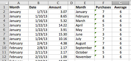
For the two charts below, I decided to use my iTunes purchased in 2013. I first downloaded a list of all of my iTunes purchases from January through November. After entering the data in columns A, B, and C, I used a couple of formulas to summarize the data by month (columns E, F, and G).
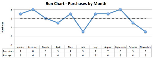
The "Purchases" (column F) shows counts of column A. In column G, "Averages," the number is simply the total number of purchases (from column F) divided by 11 months. Below is the resulting run chart:
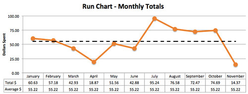
I also created a similar data set and run chart for the total amount spent per month.
In looking at these two charts, I can see that I spend more money than I would prefer on apps, music, and books from iTunes, and probably visit the store too often. In a later post, I will use this information to more closely analyze my iTunes purchases. For now, however, I accomplished my goal of objectively and simply transferring the data into a chart for a graphical view of the measurements.
If you collected data as discussed last month, it is now time to create your own run charts.
The link below will open a Google Spreadsheets file that you can save to you own Google Drive (free to setup and use). The first tab labeled "RunChartData" is the one you should select. The spreadsheet is currently populated with 30 sample data points. The average column is automatically calculated. The updated chart is displayed on the "RunChartGraph" tab.


No comments:
Post a Comment